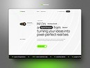
Calvora Tech needed more than a visually strong website. The goal was to create a digital presence that could clearly communicate its services, feel credible to growing businesses, and position the brand as a modern technology partner.
I worked across both design and development, taking the project from structure and visual direction to a responsive, functional website.

From Complexity to Clarity
Technology companies often have a lot to communicate - services, industries, capabilities, processes, and expertise.
The challenge was finding a way to present all of that information without making the website feel crowded. I simplified the content hierarchy, created stronger visual separation between sections, and used clear messaging to guide visitors naturally from one part of the website to the next.
The design direction was built around a simple idea: technology should feel advanced without feeling complicated. A minimal layout, strong typography, structured grids, dark visual elements, and the turquoise brand accent helped create a distinctive identity while keeping the content easy to scan.


Design Meets Development
Because I handled both the UI/UX and development, I was able to think beyond static screens.
During the design stage, I considered how layouts would behave responsively, how components could be reused, how interactions should feel, and how the visual hierarchy would translate into the final website.
This helped reduce the gap between what was designed and what was actually built. One of the key decisions was finding the right balance between professionalism and personality.
Calvora needed to feel trustworthy enough for serious businesses while still reflecting the energy of a modern digital company.